
Simplifying and reimagining study space booking
Core Reserve


In the middle of a virtual school year, Columbia University didn't stop giving students opportunities to make a change. During the Application Development Initiative's 2021 DevFest Hackathon, I collaborated with 2 teammates to design an improved experience for Columbia students to book study spaces and seats on campus in the midst of the pandemic and even after.
The Solution
-
Create a product for students too book study spaces and remember their bookings
-
Integrate pages to inform students of COVID policies and encourage social distancing while engaging with libraries in-person.
The Problem Statement
How might we help students efficiently reserve library seats at Columbia Libraries and effectively inform them about the COVID-19 regulations at those locations?
Project Overview
UX Designer
Researcher
Role
3 Days (Hackathon)
Jan. 2021
Time
Figma
Google Forms
Tools
Hackathon Design Process
Research & Pain Points
Brainstorming
Prototyping
Presentations
• Research
& Pain Points
When we started initial brainstorming, we wanted to do a topic related to the COVID-19 pandemic, since ADI's DevFest hackathon was during the 2020-2021 academic year, which was virtual for many schools, including Columbia. However, many places were slowly turning back to in-person, so we wanted to make an app to help people with this transition.
We first conducted a survey that asked various questions about people's daily habits in regards to going out during the pandemic. We wanted to specifically know 3 things:
-
What information users did users look up before going out?
-
What locations were visited frequently during pandemic (whether they followed or didn't follow CDC guidelines)?
-
How often do users look up information before going out?


We gained 4 main pain-points from analyzing the website:
-
Study Room Locations - While the room numbers are listed, there is no way of telling where exactly the room is in the library (just name of room)
-
Time Selection - Timings are a little confusing to get unless looking at a table (book in 30 min segments but each hour is split into 15 min sections).
-
Appointment Confirmation - The entire string is too long to read, and at first glance a user may think their time is the one in the select rather than the time at the beginning of the sentence.
-
Library Location Selection - Located at the top of the page, but can be missed compared to the text and main table below.
After analyzing the data from our surveys, we decided to narrow down our scope to focusing on providing COVID-19 guideline info relating to libraries, more specifically Columbia Libraries. At the time, Columbia's Libraries were opening back up, and while researching, we did a short analysis of their Seat Reservation System.
Simplifying the scope & finding pain points

• Brainstorming
The mini analysis made us realize that while Columbia's Library Seat Reservation System had some intuitive features, there were also some confusing experiences that could be made better. We also saw the opportunity to be able to reserve on an app for easy on-the-go reservations.
From the survey and web analysis, we decided we wanted to improve Columbia's system while still providing accurate COVID-19 information. So, we went to the drawing board to sketch ideas of potential features for our app.


• Prototyping
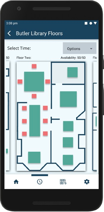
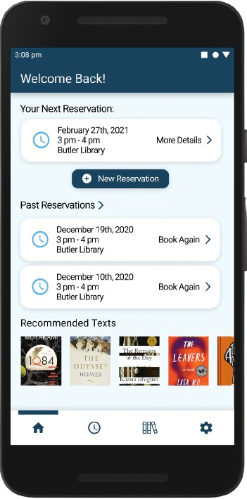
After brainstorming, we went straight into creating the prototype in Figma. We focused on revamping the reservation process with seat visualizations while adding some of our own features like reserving books for study sessions and creating friend groups to study with.


Full Booking Flow w/
Floorplan Visualizations
Quick Booking for students who know where they want to study


Students can requests for texts that will be ready when they arrive for their library session
Students can get a convenient, condensed set of COVID-19 guidelines.


Students can see their friends' schedules so they can coordinate study sessions
Students can invite friends into their circle so they can easily book spaces together.
• Presentation
For our final submission, we were required to create a video presentation, showcasing our idea and a demo of our prototype. We also did this same presentation live at the end of the presentation, after we made it to the final round of judging.
Click-through Prototype - Try it out!
Reflections
-
Collaborating with others is an integral part of being a designer. Throughout the hackathon, I worked on improving my communication skills with my teammates while also teaching them about how to use Figma with design principles.
-
There's different ways to get research on a design prompt. This was my first attempt at gathering research for a UX project, so I learned a lot about how to write non-leading questions for the survey and analyze data results.
My Takeaways
As Columbia starting returning to in-person learning, libraries on campus started getting more foot traffic. Students wanted to go to the libraries rather than sitting at home all day, but the platform for booking study rooms was unintuitive and it was hard to find the rules to abide by during the COVID-19 pandemic
For this project, I focused on the user experience of booking study spaces on campus. This was a project done in during a 3-day hackathon weekend - so a lot of the decisions made were on intuition of us as students. However, we gained valuable insights in where to focus our project. However, after our presentation, we gained a lot of interest from CU IT in our app and many of the professors expressed positive thoughts about the potential for the idea.